FIGMA PRO LOGO

The Professional Design Arms Race Is Heating Up...

Master Figma to Become Your Niche's Most Sought-After, Highly-Paid Designer

Award-Winning Senior Creative Director Teaches You His 8-Stage “Figma Mastery System” For Creating More Beautiful Design Work, For Better Clients, Faster Than Ever

The design system used for projects with billion-dollar companies

Group 187
Group 188
Group 189
Group 190

On September 27, 2016,
The Design Game Changed Forever...

Ever since Figma released in 2016

The design world has been shaken up.

Now, designers who master Figma have an unfair advantage over the competition...

Figma-skilled designers command 10-20% higher salaries

than non-Figma users, according to a 2022 Design Salary Survey by Hired. (Source: Hired Design Salary Report 2023)

Jobs with "Figma" in the title pay 15-20% more...

on average than those without according to Indeed data. (Source: Indeed Salary Search, accessed Dec 2023)

Companies using Figma tend to be larger and more established...

with bigger budgets and higher project values. Mastering Figma opens doors to these lucrative projects. (Source: BuiltWith Market Share Data)

The demand for Figma skills is outpacing the supply, creating a talent gap.

This benefits designers who acquire these skills, giving them a competitive edge and potentially negotiating higher salaries. (Source: BuiltWith Market Share Data & Hired Report)

It’s why the top companies in the world require their designers to master Figma

Group 195
Group 196
Group 197
Group 198
Group 200
Group 199

It’s why designers not using Figma are getting left behind.

In this fast-changing world of design, you need to adapt, or get left behind.

With its rapid growth and adoption, Figma is quickly becoming the go-to design platform.

Not using Figma puts you at a disadvantage...
Losing out on jobs...

Slowing down your workflow...

And limiting the potential of your designs.

But the second you master it, it turns you into an in-demand superhero designer.

Mastery & Recognition Master Figma and level up your design game—become a standout in the design world, boost your reputation, and attract top-tier clients effortlessly.

Time-Saving & Efficiency Save precious time by learning Figma's intuitive workflows and ditching complex tools, allowing you to focus on creativity and passion projects.

Stay Ahead of the Curve Stay relevant and competitive by mastering the latest design tool used by top designers, future-proofing your career.

Seamless Collaboration Break free from email chains and version control nightmares! Figma fosters smooth collaboration with clients and teams, making your life easier.

alex-schleifer

"If you're not using Figma, you're at a disadvantage. It's the future of design collaboration, and it's essential for staying competitive in today's market."

Airbnb Design Team
(Source: Airbnb Design Blog)

alex-schleifer
Screen+Shot+2017-04-22+at+11.58.49+PM

"Figma has become the lingua franca of design. It's the language we speak to each other, across teams, disciplines, and even continents. Learning Figma is like learning a new language that opens doors to countless possibilities."

InVision Design Team
(Source: InVision Blog)

But, Figma’s tools & Plug-ins aren’t enough. You need a system.

Despite the plethora of tools and tutorials available online, learning Figma on your own can be a lengthy and frustrating process, often taking months of trial and error.
Without a systematic approach, designers face challenges like endless revisions, inefficient workflow, and poor project organization.
A structured, step-by-step design system is crucial to avoid these pitfalls and to fully leverage Figma's capabilities for efficient and high-quality design output.

I’ve Built Figma Design Teams & Systems for Billion-Dollar Companies

mike-0WRGADFBSZXCB

I am devoted to continuously educating myself and staying updated on the latest trends and best practices in design, branding, and advertising. Regularly schooling my thought process fuels my creativity.

With decades of diverse industry experience, from major agencies to startups, I bring a wealth of multi-disciplinary knowledge to every project. My passion is crafting human-centric digital experiences - interfaces that are usable, on-brand, visually appealing, and emotionally engaging.


I deeply care about each project and work closely with enthusiastic clients to truly understand their business and users. This understanding informs solutions that balance aesthetics, clarity, and function into smooth, impactful designs.


My tireless curiosity and holistic approach make me an asset to every team. I leverage my expertise across UX, UI, branding, and visual design to tackle challenges with wisdom and elevate projects to the next level. The end goal is always to experience that delight.

Clients I Worked With

Group 191
Group 192
Group 194
Group 193

NEW ONLINE PROGRAM

Now Get My Exact 'Figma Design System' to Ship World-Class Designs

Faster and Easier than You Ever Though Possible
mike-mockup
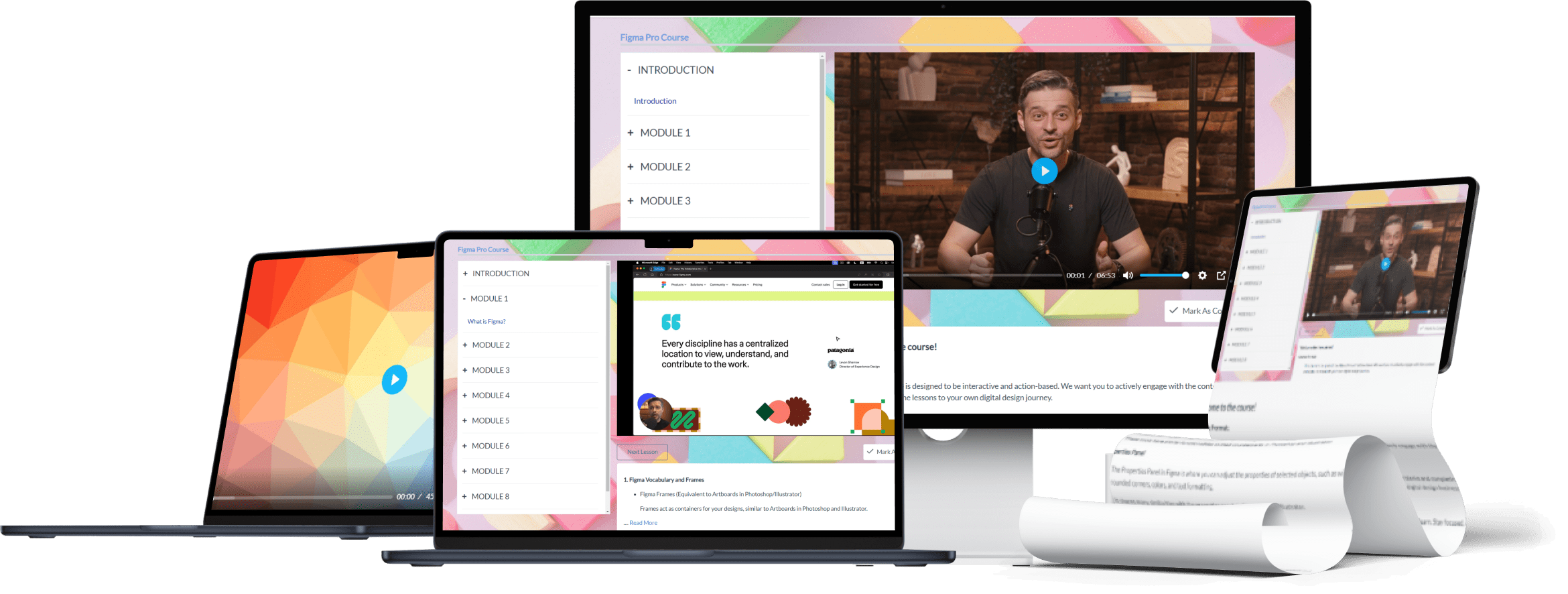
It’s an interactive Online Program where I’ll give you a Step-by-Step Figma Design System that gives you a structure to express your creativity - using tools and processes to deliver the best designs of your life, faster than ever.

SLOTS RUNNING OUT! HURRY!

6f71673126d642ae6eca455248627274

This 6-Step Process Takes You From Overworked Designer to a Figma Pro

In Just Eight Sessions!
Untitled design (67)4
ICONS FIGMA

What's Inside:

Figma is a revolutionary new design platform—is it right for you? This module equips you with deep knowledge so you can decide. Understand key concepts like frames, vector networks, and layout grids through interactive demonstrations. See how Figma’s web-based flexibility enables features impossible in older desktop software. Learn what makes it superior for interface design compared to tools like Photoshop.
 

What you’ll learn:

· Confidently navigate Figma’s clean intuitive interface to access its full capability
· Create designs rapidly by mastering essential tools to add shapes, text, paths and more with precision
· Organize complex projects gracefully via the intuitive Layers panel, keeping assets findable
· Liberate workflows from redundancy by building reusable components that update sitewide automatically
· Make professional designs shine by accentuating key elements with drop shadows and background blurs
· Compare the origins, strengths and limitations of seminal creative software like Photoshop, Illustrator and Sketch
· Get tactile experience with core concepts through hands-on video challenges and quizzes after each lesson
Before rushing into execution, smart preparation separates good from phenomenal work. This module cultivates best practice ideation habits to yield a bountiful creative harvest every time. First, discover how to tap boundless inspiration through sites like Behance. Then, channel ideas efficiently by curating a sharply focused mood board. Finally, assess your direction by benchmarking against professional examples—absorb what delights users, and dodge pitfalls revealed in weaker efforts.
 
What you’ll learn:
· Stimulate innovation by compiling inspiration galleries with grepper to extract visually-stunning references from across the web
· Maintain clarity of purpose by condensing sprawling concepts into a concentrated mood board guiding all design choices
· Kickstart creation by reverse engineering what appeals in leading examples, alongside flagging distracting or ineffective elements
· Survey existing solutions to identify unmet user needs your concept could resolve for a competitive edge
 
· Reinvigorate stagnant thinking by runing text prompts through AI imagination-enhancers like DALL-E 2
· Stretch creative muscles applying ideas from unrelated domains to progress past linear derivative solutions
Ease paralyzing pressure by embracing sketching not as crafting perfected illustrations, but thinking made visible. Using pens, paper and simple geometric shapes, iterate concepts quickly without expectation— it’s idea origami, folding experience into novel forms. Scribble layout possibilities until clear patterns emerge. Photograph then import these wireframes into Figma, creating draft compositions ready for refinement. Through unfiltered experimentation, uncover the unexpected design brilliance lying just below the surface.

What you’ll learn:
· Short-circuit tunnel vision by sketching 5 substantially different directions before judging, to widen the possibility space
· Identify promising layouts, information hierarchies and content groupings through rapidly-produced paper prototypes
· Photograph hand drawings or scan into digital format for porting wireframes swiftly into Figma using shapes
· Explore variations freely on separate pages to maintain a visual record for later review
· Disrupt habitual ideas by introducing random image prompts as creative springboards
· Preserve spontaneity in digital translations by keeping hand-drawn traces visible amidst cleaned up assets
Establishing robust framework early multiplying returns later. This module constructs a systematic content architecture through reusable components ensuring smooth handoff for developers, and enabling easy ongoing modifications. Cluster common repeated items like buttons into labeled sets for efficient access. Map information flows via linked prototypes simulating real-world user journeys. Strong foundations now pay dividends for years via better consistency, organization and scalability.

What you’ll learn:
· Design complex systems efficiently by making elements like buttons, bars and icons retriggerable components
· Organize thousands of assets masterfully by sorting related builds into accurate labeled groups
· Liberate brainpower for higher priorities by eliminating redundant actions as updating master components cascades sitewide
· Plot multifaceted customer experiences via interactive prototypes mirroring product navigation paths
· Share living libraries enabling developer integration directly within Figma to reduce QA backtracking
· Future-proof accessibility by establishing proper colour contrast and semantic markup from the start
Great execution starts with a blurred vision sharpened iteratively; don’t be perfect, be prolific. Initiate building by getting key content blocked: headline, body text, images and calls-to-action. Refine aesthetics later; focus now on positioning elements clearly given space constraints. Does the path for consuming information make sense? Can the purpose be grasped within crucial initial 10 seconds? Pour ideas out rapidly without censoring quality; assess objectively after. Build, analyze and revise - sharpen vision through a lens of user experience.
 
What you’ll learn:
· Lay design foundations rapidly using premade wireframing templates aligned to common formats
· Scope objectives and block content quickly using frame presets for mobile, web and presentation sizes
· Develop clear visual hierarchy via sharp contrast between elevated focus items against background
· Boost ideation by interrogating initial builds against best-practice guides embedded within Figma
· Expedite asset generation by modifying proven templates like iOS or Android app frameworks
· Clarify messaging by evaluating if intended tone matches actual cognitive/emotional response
Not all experiments will be victories, but all progress demands experimentation. This module explores the design iteration process - translating static compositions into dynamic user experiences. Sample techniques like parallax motion to add depth as users scroll. Introduce hovering micro-interactions to highlight clickable elements. Cycle through hero images reflecting diverse users. Add reveal animations to signal new sections. Vary fonts, colours and layouts. Completed products should scream “love me” not “tolerate me”. Build resonance by polishing pixels ‘till they’re irresistible.
 
What you’ll learn:
· Elevate visual dynamism through cinemagraph-style animate foreground elements against static backgrounds
· Direct focus subtly by enlarging buttons on hover using conditional triggering logic
· Maintain visual diversity incorporating illustrated characters representing varied demographics
· Celebrate uniqueness by displaying motivating messages when users complete milestone activities
· Spotlight inner pages by expanding header logo into vibrant introductory transition graphics on-click
· Analyze emotional sentiment quantitatively by running designs through machine learning image classifiers
Skill and taste guide expert refinement maximizing appeal by perfecting every last 0.1% detail. Ensure compositions abide clear alignment rules with position/size consistency across elements like icons. Use constraint settings for spacing/padding precision. Does the visual weight distribution feel right? Bestcheck.dev audits for balance. Scrutinize colors critically - do choices strengthen brand identity? Review typography impacts - do font pairings project intended tone? Print final designs onquality stock analyzing textures closely. Sweat microdetails - it’s the icing that makes people fall madly in love.
 
What you’ll learn:
· Ensure pixel perfection abiding alignment/spacing guidelines to polish overall aesthetic
· Manipulate visual weight achieving intended focus hierarchy through selectively accentuated scale/color
· Maintain cohesive styles reinforcing branding via linked character/paragraph presets adjusting universally
· Critically appraise color palettes against psychology targeting desired responses from users
· Judge compositions empirically referencing principles like rule of thirds, divine ratio and golden spirals
· Proof meticulously across unique contexts like varying mobile devices, printers and monitor calibers.

Closing well cements great first impressions made to win work and build reputation. This module examines essential aspects of delivering client-ready files able to withstand enterprise environments and approval processes. Ensure specifications match needs whether high-resolution printable artwork or compressed social videos. Check formatting follows protocols to guarantee accuracy. Enable smooth handoffs preparing assets directly importable into CMS databases via Figma’s API integrations. Wowing at finish line clinches quality perception; stick the landing.

What you’ll learn:
· Verify files optimized for usage context - print vs digital requirements need distinct resolution/color
· Export web assets with minified SVG/PNGs at optimized sizes to accelerate site speed materially
· Structure layered Photoshop translations retaining groupings to simplify developer CSS/style extraction
· Add metadata like descriptions to critical frames ensuring clear purpose communication without overlap
· Configure seamless CMS connectivity plugins inserting Figma builds directly into WordPress and Shopify
· Automate transcoding into mandated enterprise formats like PDF/X-4 for large corporates

Prototyping is the stage where designs come to life, allowing you to present the app to your team or client in a dynamic way. In this module, we will explore how to build interactive connections between screens and simulate user flows.

What you’ll learn:
·  How to enter and navigate Prototype Mode by switching from the Design tab.
· Create connections between screens using the plus signs on UI elements to map out interactions (e.g., linking the Sign In button to the Home Page).
· Apply different animation effects like Instant AnimationDissolve, or Smart Animate for transitions between screens.
· Adjust transition speeds and effects like Slide InEase In, and even add fun bounce animations.
· Build a semi-working app by connecting user flows such as Add to CartPlace Order, and Customer Service.
· Preview your prototype by using Control + Shift + Space (or Command + Shift + Space) to simulate interactions.

In this module, you’ll learn how to create basic animations to enhance app designs, especially when presenting prototypes to teams or clients. By combining animations with the prototype tool, you can add dynamic transitions to user interactions.

What you’ll learn:
· Setting up animations: Work with components that have multiple states (e.g., a shopping cart with closed and open states).
· Detaching instances: Learn to detach a component instance to enable animations, as components cannot be animated in their original state.
· State management: Name and manage states (e.g., "Default" and "Delete") to reflect different interaction points in the app.
· Prototyping with animations: Use the Prototype tab to link frames together, defining interactions such as On ClickOn Hover, and While Pressing.
· Applying Smart Animate: Set up transitions with Smart Animate to create smooth animations between states, and choose effects like Ease InEase Out, or Bounce for a polished feel.
· Navigating prototypes: Link animations back to default states and test the flow in the preview mode using Shift + Control + Space (or Shift + Command + Space).
· Preview options: Launch the preview using either the play icon or keyboard shortcuts to simulate and view animations in action.

SLOTS RUNNING OUT! HURRY!

6f71673126d642ae6eca455248627274

Figma Pro is Not Just a Course, It's an Entire Design System.

This is not just tactics and tools - instead, this is a complete process to rethink you way the design.

It’ll guide you through the 6 stages that current design pros go through to knock out top-teir designs effortlessly, in the shortest time possible.

Need proof?

This Has Been The Exact System I've Used to Train Designers

And Ship Projects for International Brands
danube-sa-01

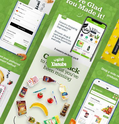
Danube.sa - Super Market

A high-end supermarket in Saudi Arabia underwent a complete rebrand, including the second version of its company identity and brand guidelines, tailored for digital marketing and email newsletters. I developed comprehensive brand guidelines featuring various assets, along with UX/UI design for both their website and app. I invite you to review the brand guidelines I created.
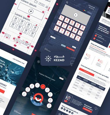
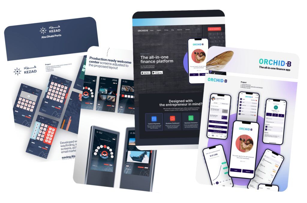
Kezad-AbuDhabi-Ports-01

KEZAD - Abu Dhabi Ports

Led the in-house development of wayfinding, information screens, ad banners, and email marketing for the welcome center. Provided UX/UI design direction for both the website and touch screens, and crafted the brand guidelines for Kezad Abu Dhabi Ports.

Kezad-AbuDhabi-Ports-01
expo-2020-dubai-01

Expo 2020 Dubai

Led a team of 15 designers in creating and animating content for over 1,000 LED screens at Expo 2020 Dubai. Spearheaded the design, UX/UI, and brand guidelines for LED content and animation, resulting in a comprehensive 177-page guide.

Plus Get Access to $2000+ of Bonuses To Elevate Your Designs Even Further

100% Money-Back Satisfaction Guarantee

I'm so confident this is the fastest path to Figma mastery, I guarantee it.

Join the course, implement the strategies, and if you don't unlock exceptional skills within 30 days, simply contact me for a full, no-questions-asked refund.

I won't leave you stranded - you'll either gain elite design abilities or get every cent back.

Today's Price

One-time payment. Money-back guarantee.

mike-mockup

Over $5000 Value - Master Figma in 4 Weeks

And Elevate Your Design Career

My Handpicked Figma Plugins

My AI Brainstorming Framework

My Design Psychology Knowledge Hub

My Exclusive Typography Black Book

My Emotional Color Alchemy Swatches

The Final Flight Checklist I Swear By

Today's Price

TODAY'S PRICE:

$97

SLOTS RUNNING OUT! HURRY!

6f71673126d642ae6eca455248627274

📢

Spots Closing Soon

I only open access to Figma Pro a few times a year. Secure your spot today to avoid missing out.
6f71673126d642ae6eca455248627274

Frequently Asked Questions

Copyright Figma Pro 2024 | All Rights Reserved